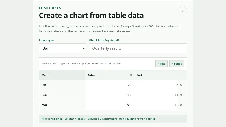
Edit the cells directly
Open Chart below the editor. Enter labels in the first column and series names and values in the following columns. You can paste a selected range from Excel, Google Sheets, or CSV into the active cell.
Current limits
Bar and line charts support up to 12 labels and 4 series. Pie and doughnut charts use one series. Place no more than one Chart on a slide.
Choose the chart type intentionally
Use bars to compare categories, a line for change over time, and pie or doughnut for a small number of shares of a whole. State the meaning, period, and unit of the values, and never present sample numbers as actual results.